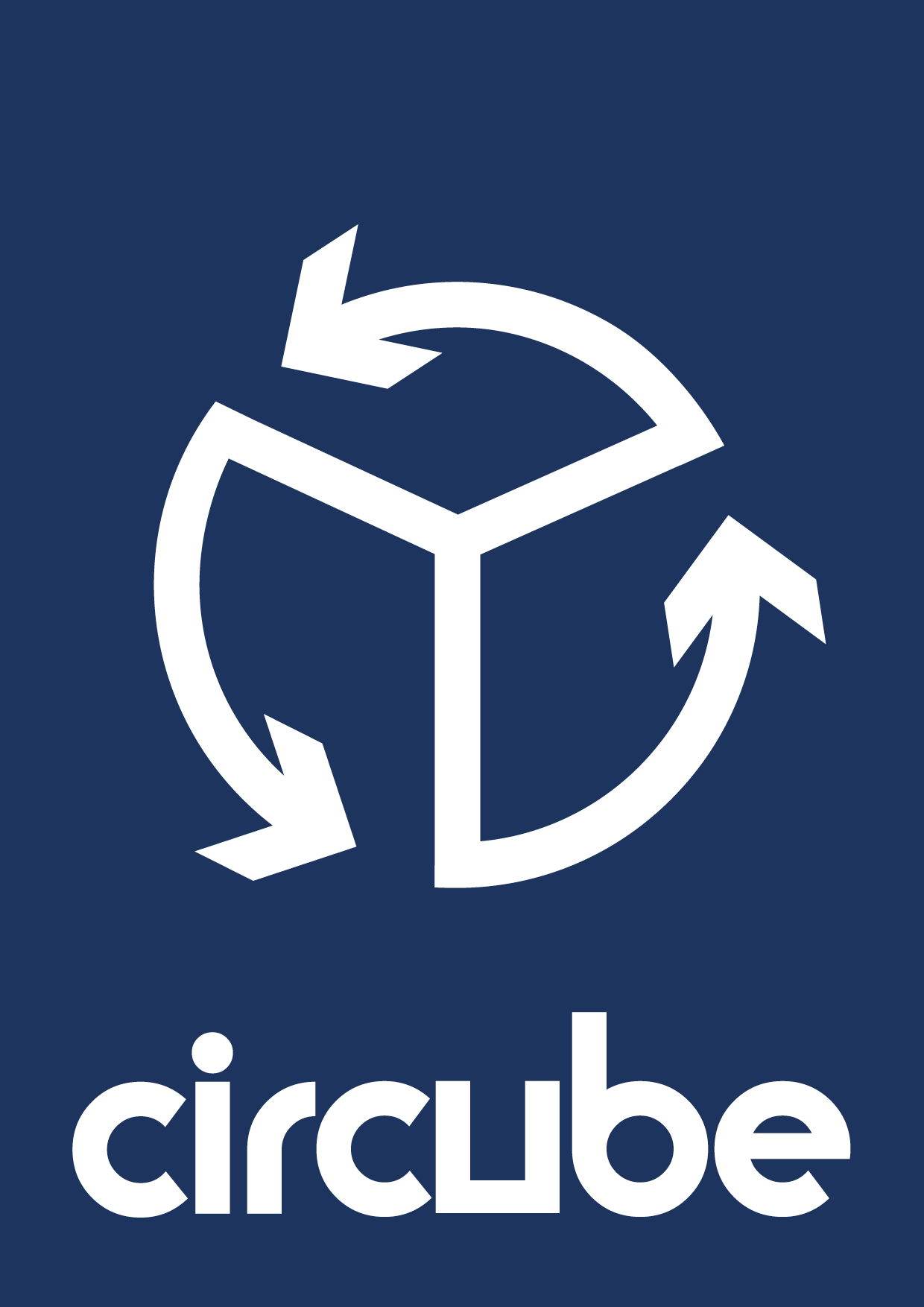
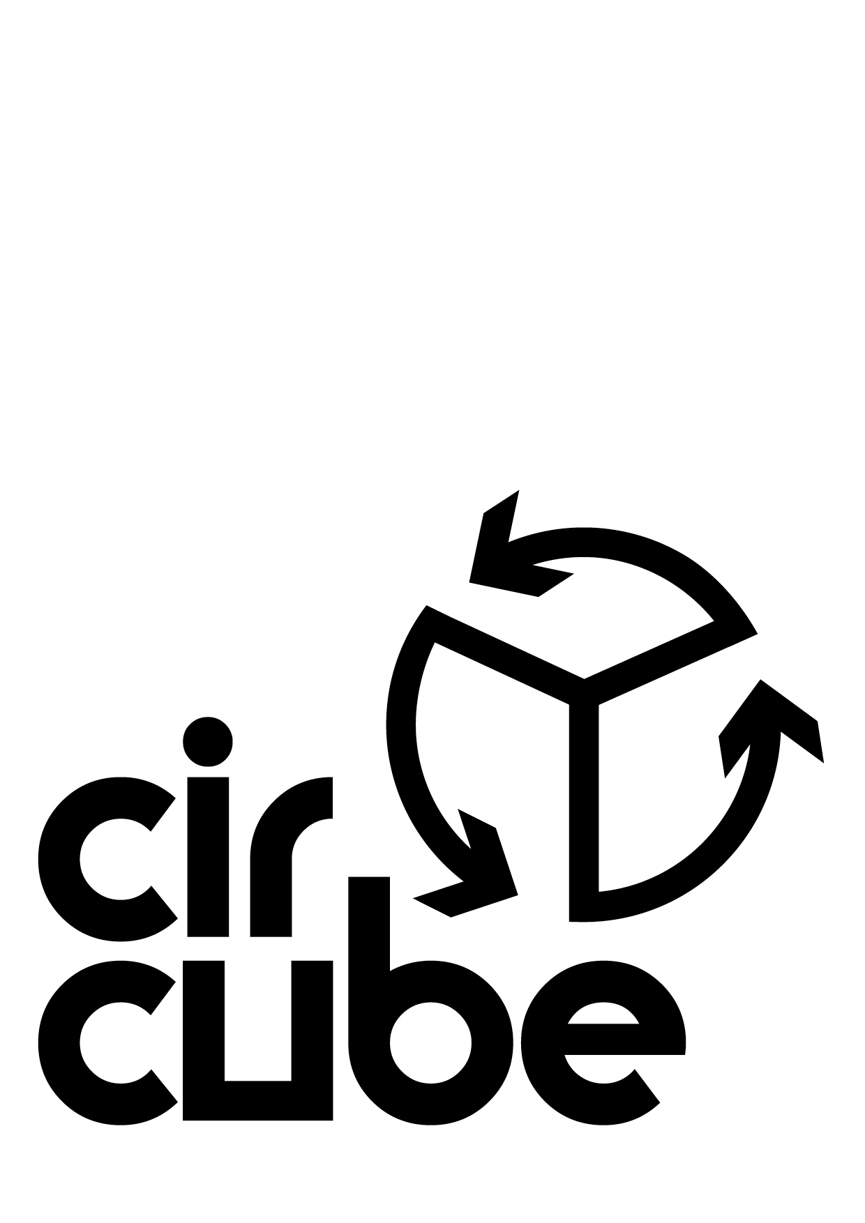
CIRCUBE
Identity Development
This brand identity was developed as part of a larger business pitch.
Read more below about Circube and the identity design.

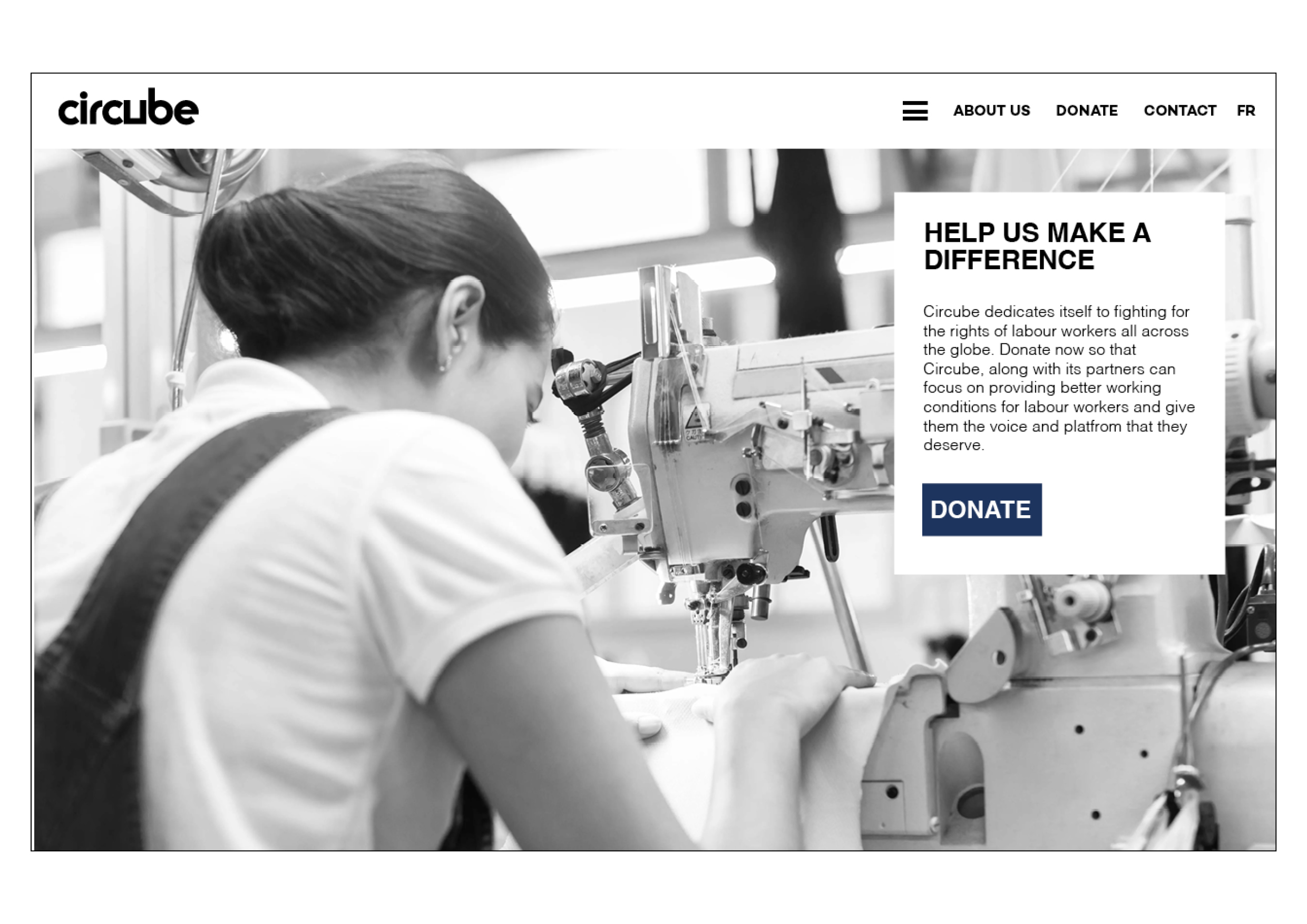
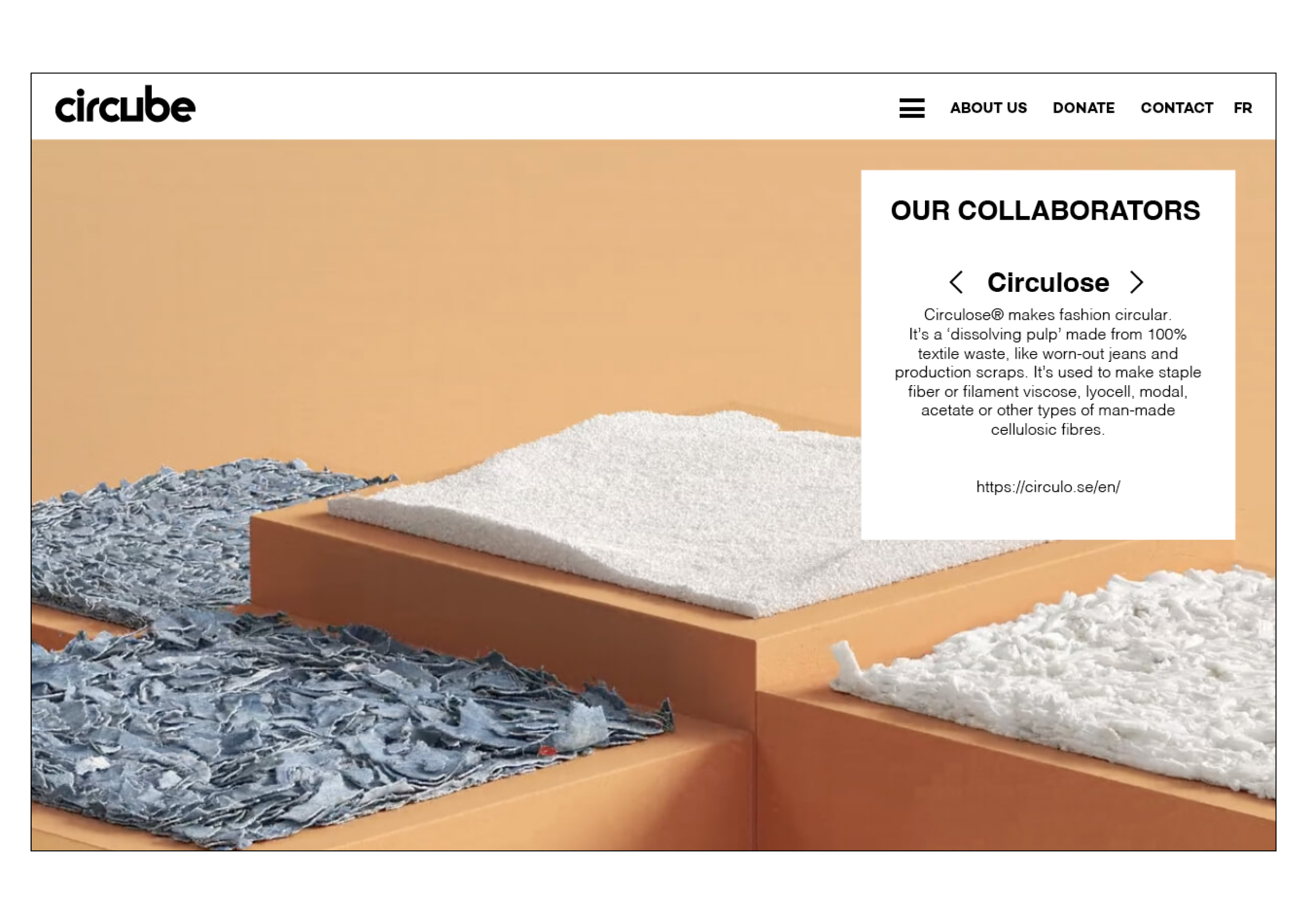
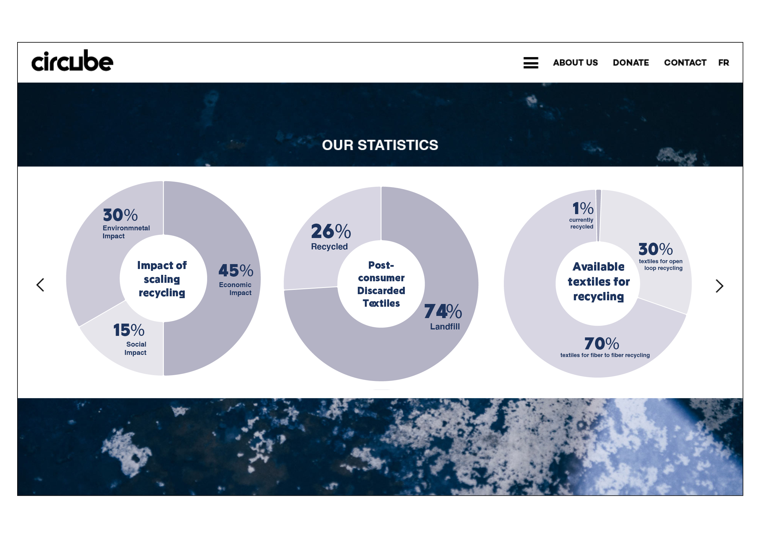
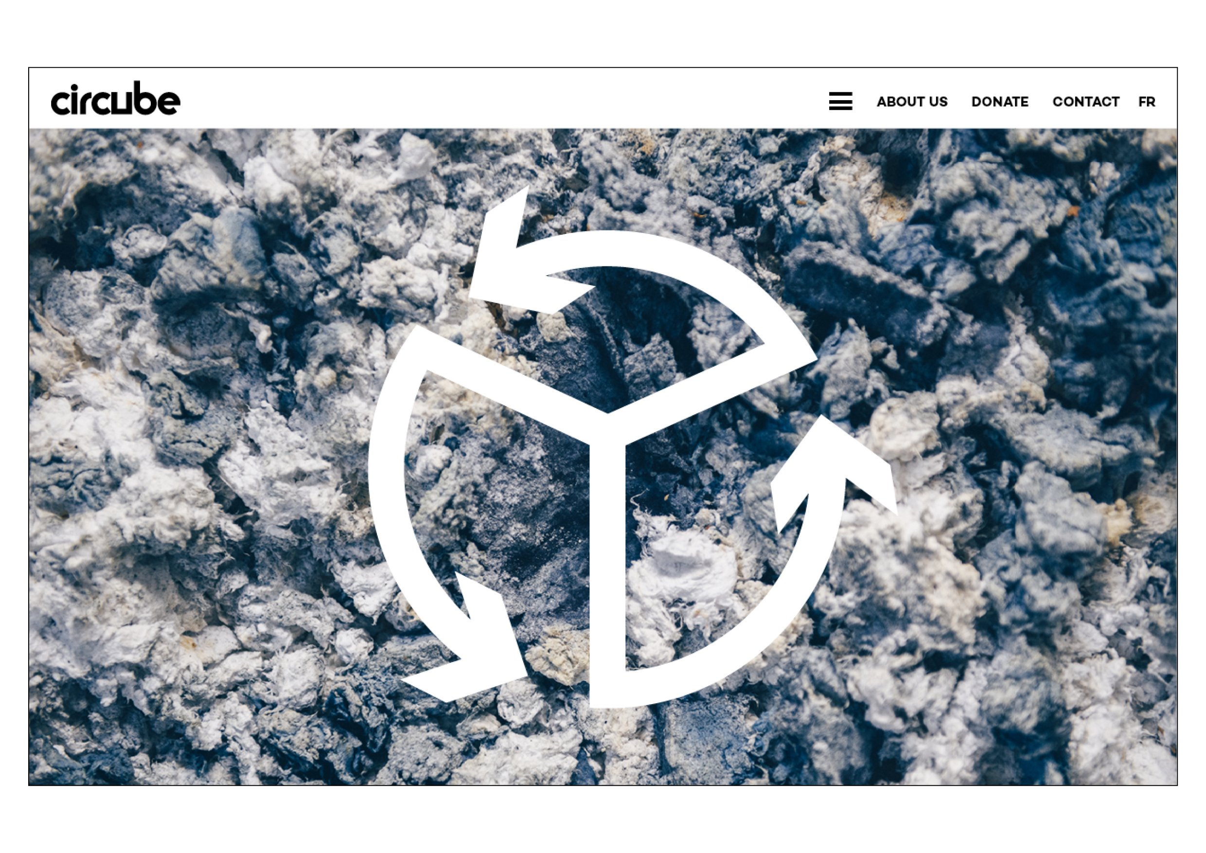
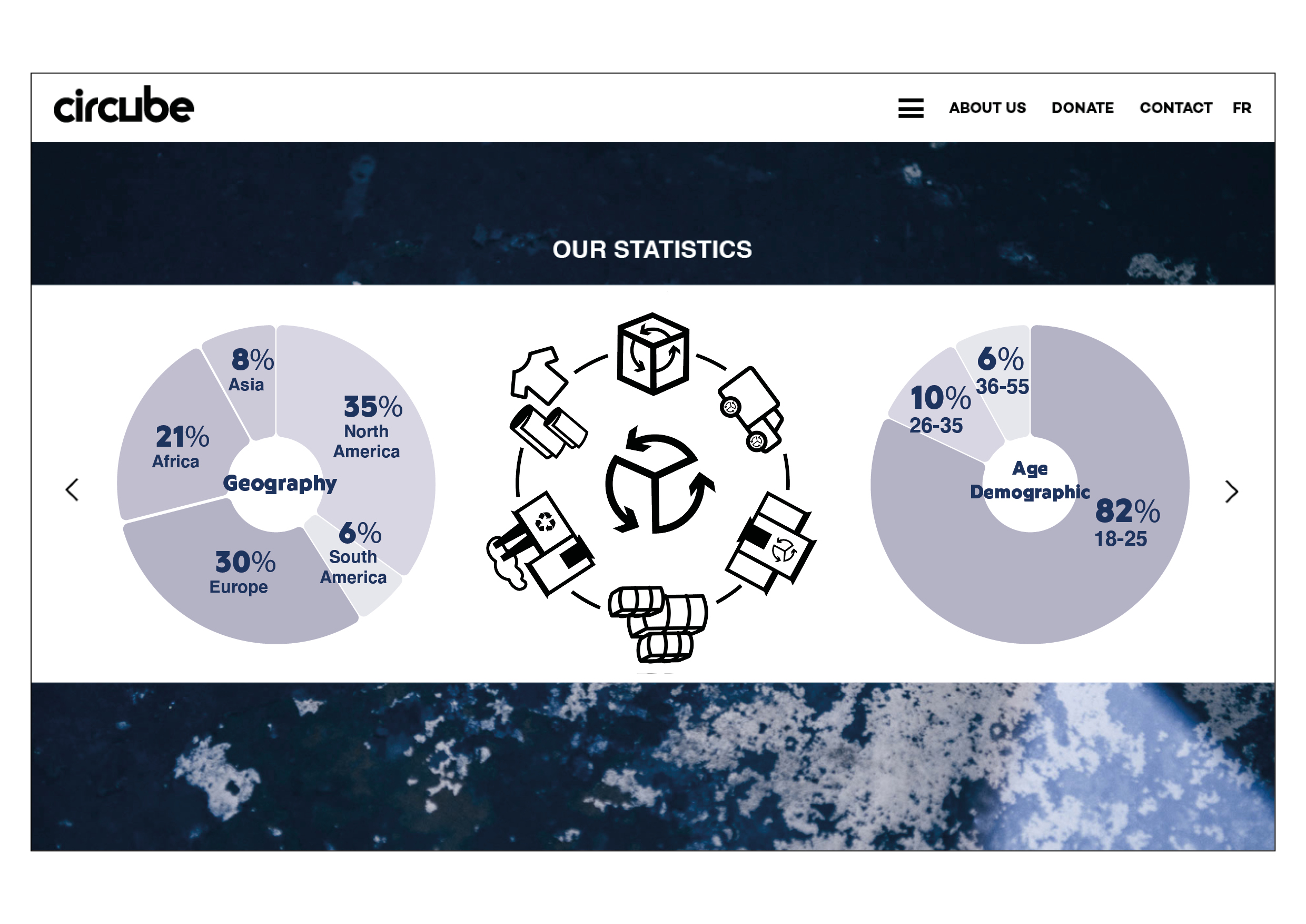
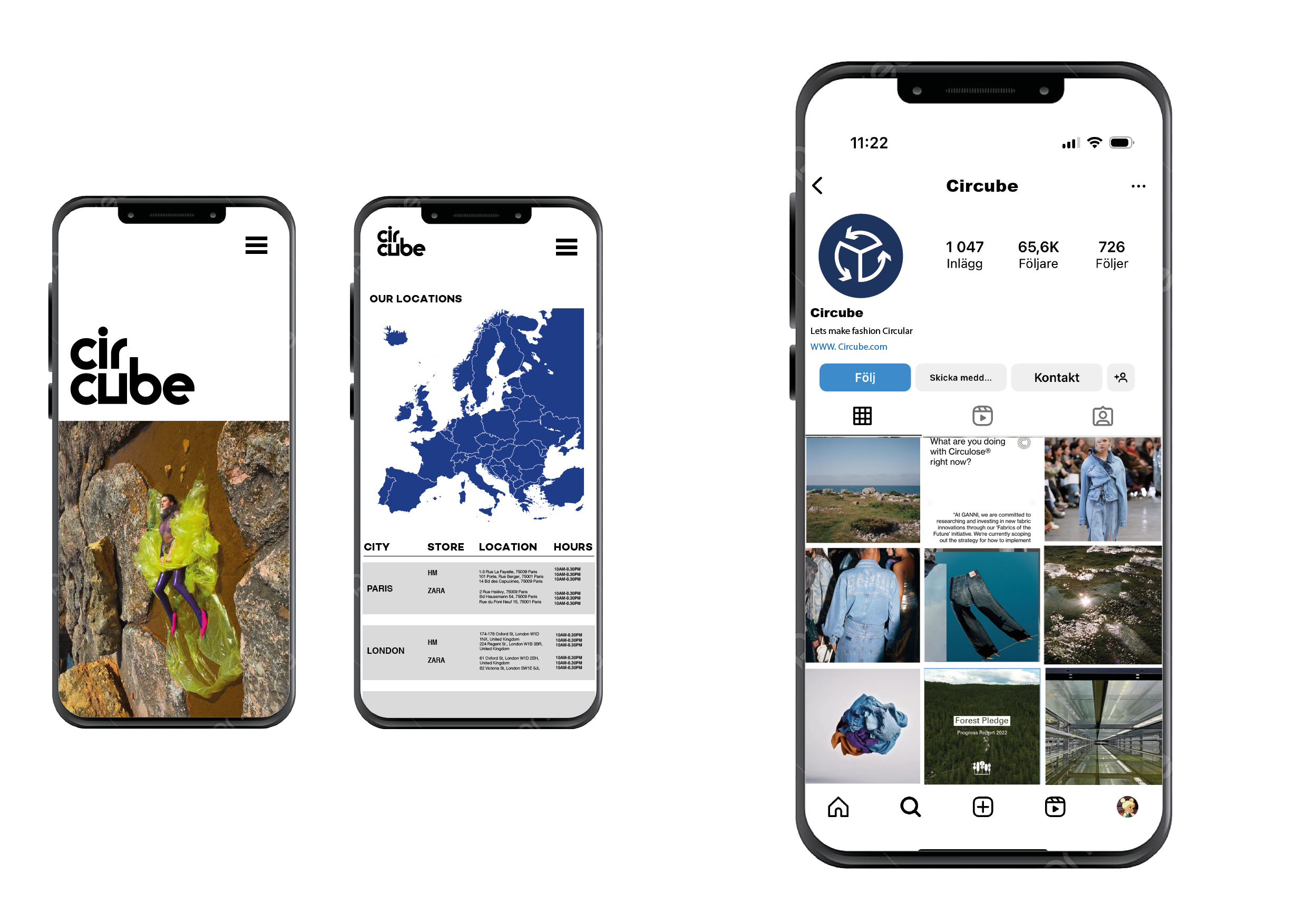
WEBSITE IMPLEMENTATION:

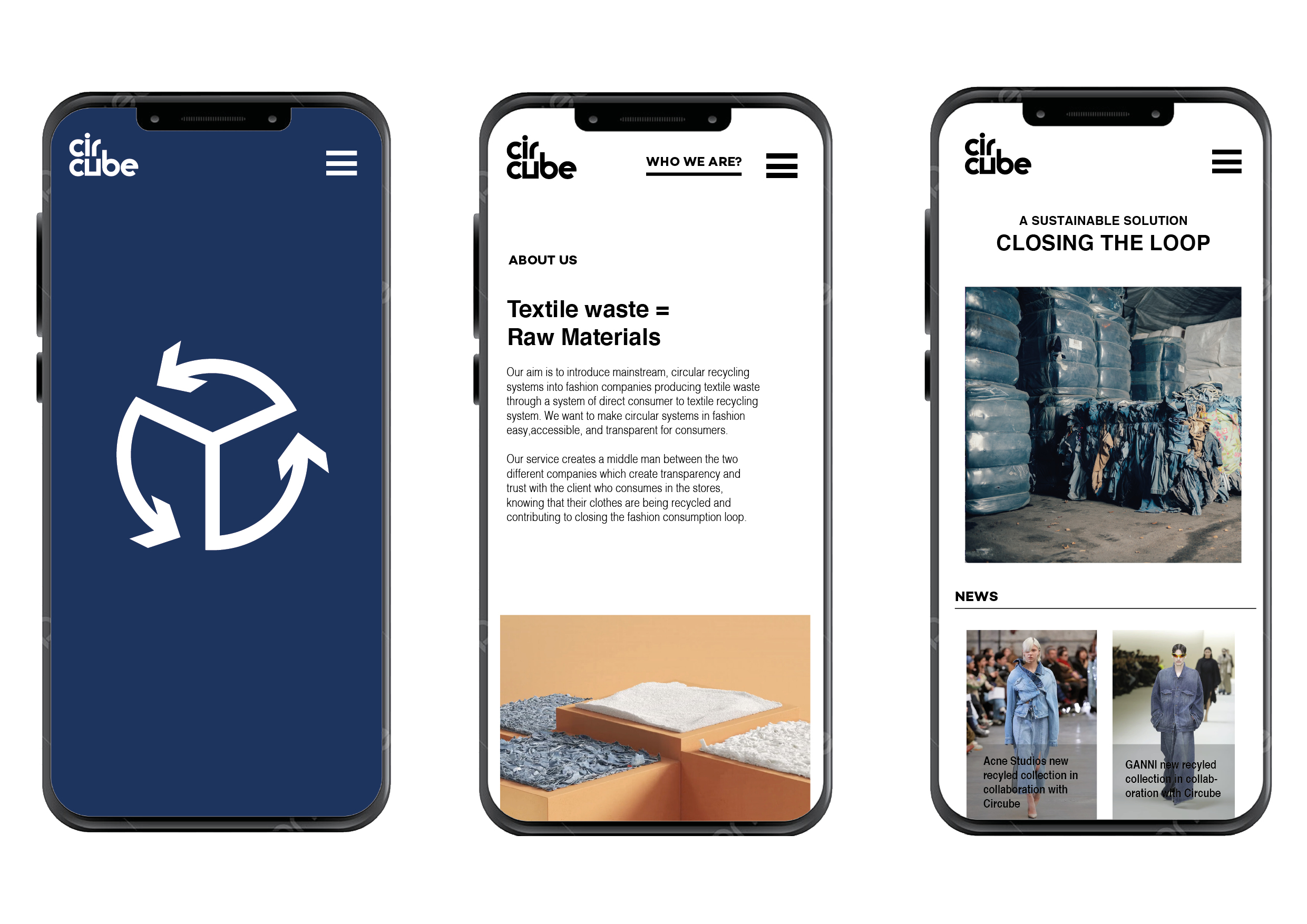
MOBILE IMPLEMENTATION:
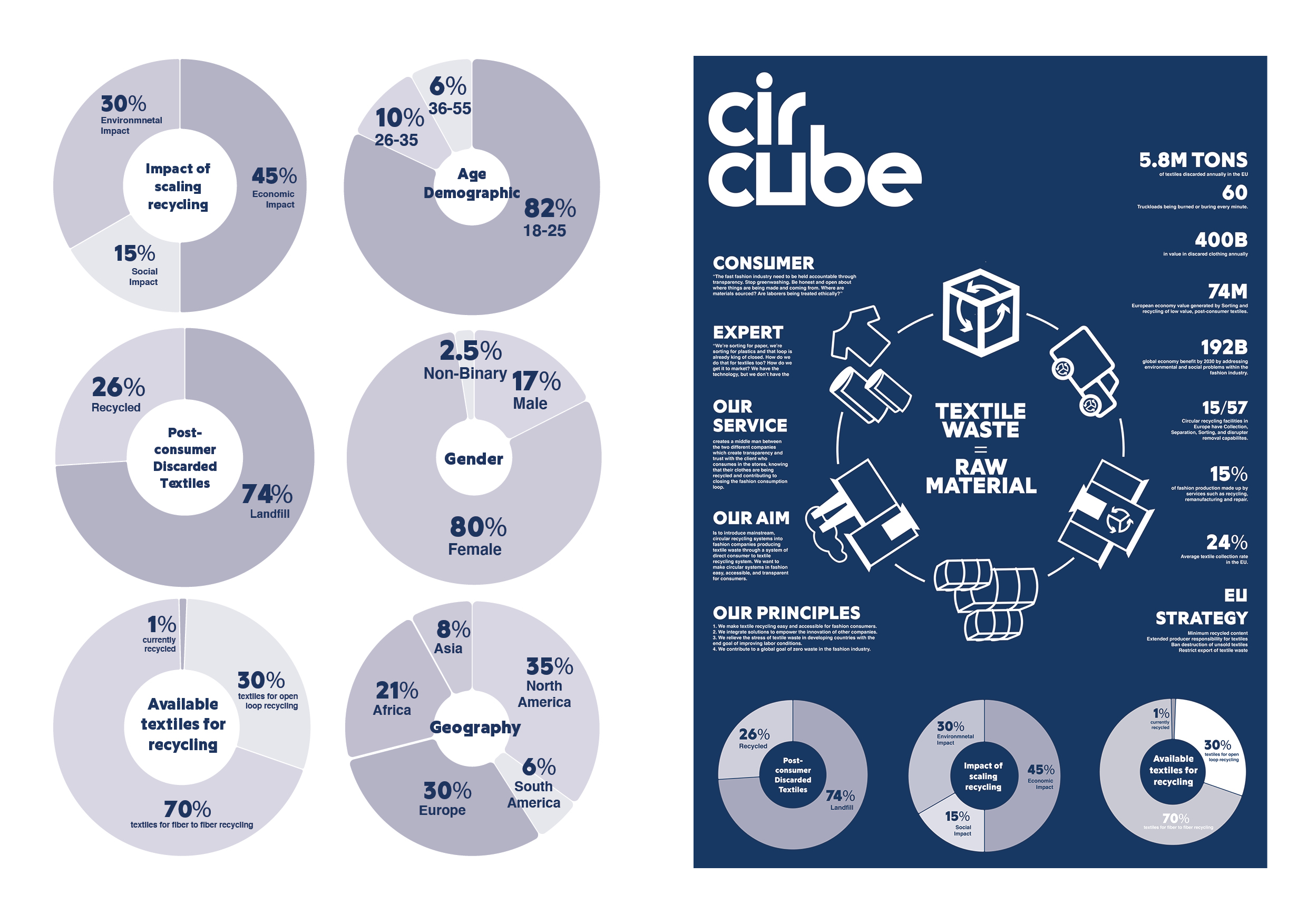
INFORMATIONAL POSTER:
ABOUT CIRBUBE:
Circube is a middle man service between the mainstream clothing stores and recycling facilities. Circube provides consumers with the access to textile recycling through the Circube collection box. Textiles are then collected, sorted, and sent to recycling facilities around Europe to provide these facilities with the correct materials they need to empower collective recycling innovation. Circube creates transparency and trust with consumers in the stores, knowing that their clothes are being recycled and contributing to closing the fashion consumption loop.
Our aim is to introduce mainstream, circular recycling systems into fashion companies producing textile waste through a system of direct consumer to textile recycling industries. We want to make circular systems in fashion easy, accessible, and transparent for consumers. We also aim to advance the current textile recycling system by implementing our company into an area of the the system which needs to be improved.
RATIONALE:
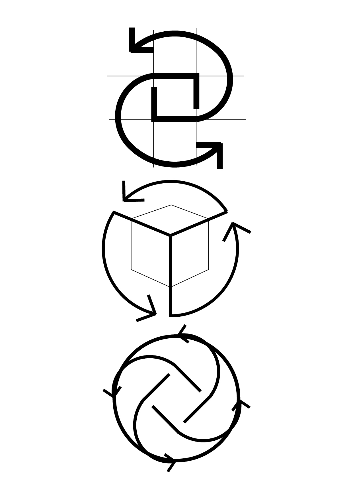
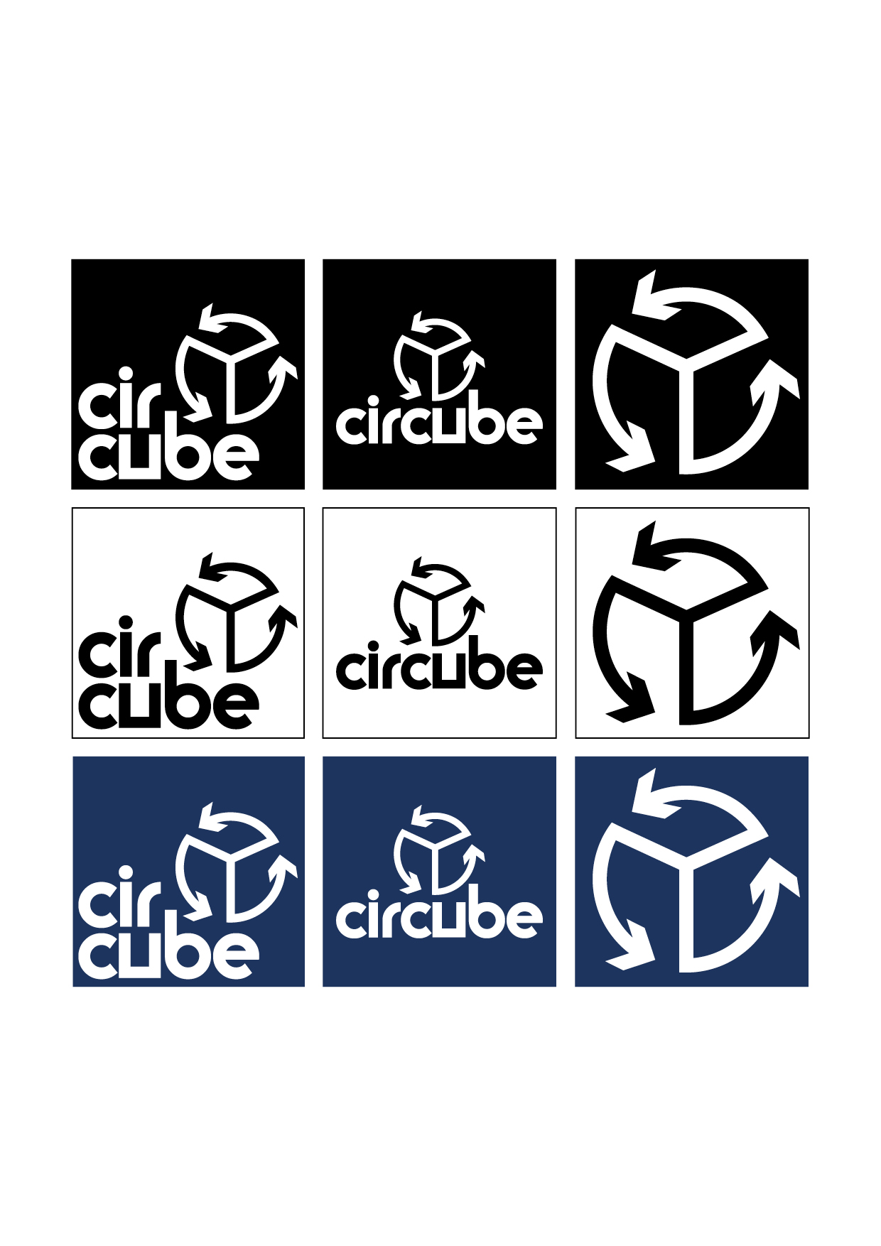
The final version of the logo is a blend of the icon and typography design prototyped previously. These elements can be implemented separately or together depending on the context.
The icon is a combination of the three arrows in the recycling symbol and the outlines of a cube. Together they create a geometric circle shape with a 3D element. It also has visual references to a peace sign, which is in line with the principles of Circube. It has a heavy stroke, minimal lines, and is clear and concise. This makes it easy to understand and readable at any scale. The icon will be used to quickly spot our collection boxes, and create familiarity. It’s shape also serves as a point of reference for the typography design.
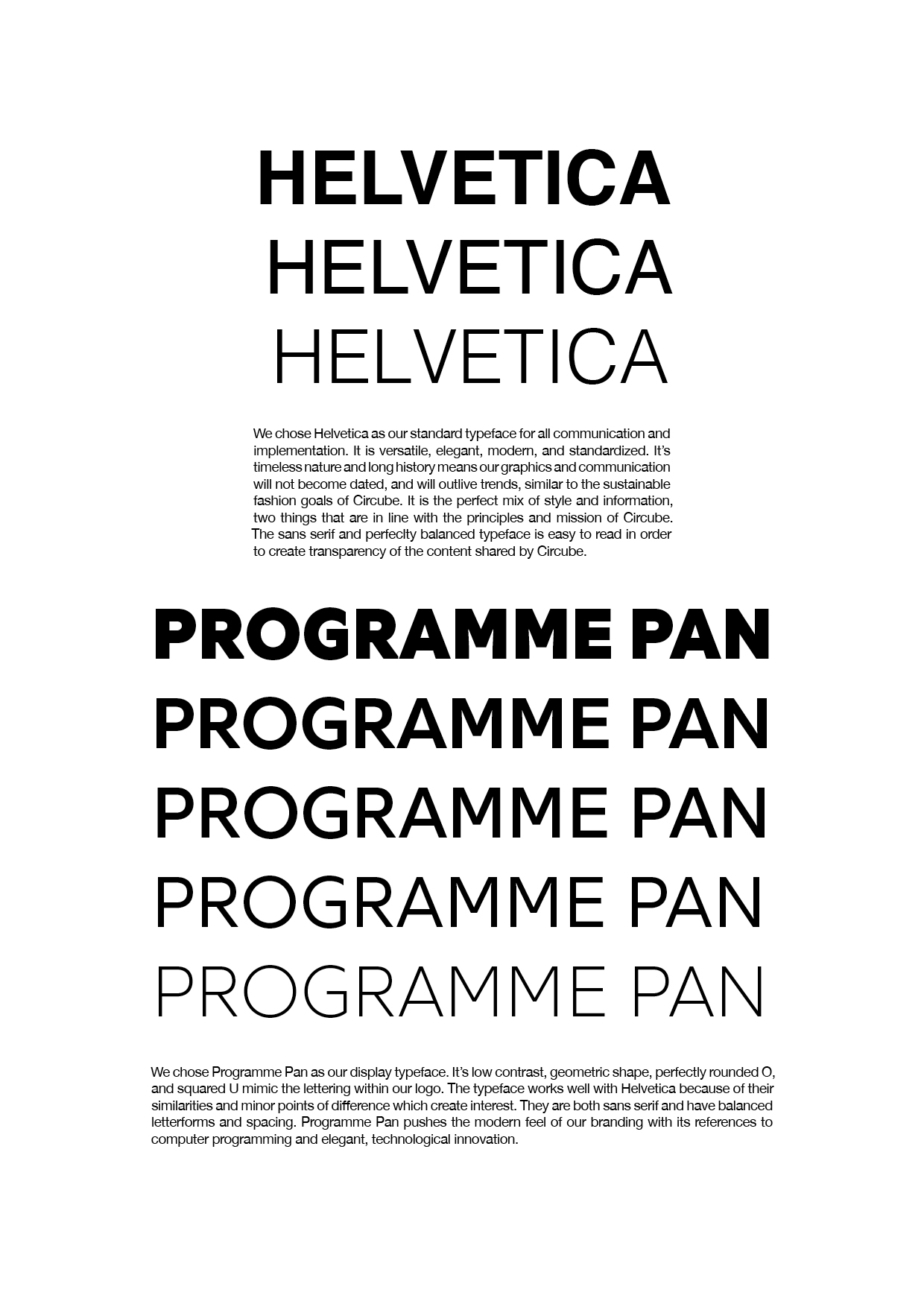
The Circube lettering uses the Moderna typeface, with an alteration of the letter U to form it into a squared shape. The majority of the letters in the word Circube are based on the circle shape, something very important to the branding and purpose of the company. The perfect geometry and balanced letterforms reference the icon and create harmony. The line break between “cir” and “cube” visualizes the story behind the brand name. Circube is a blend of the word circle and cube, the circle referring to circular business practices within fashion, and the cube referring to the Circube collection box. Both shapes are present throughout the identity design, especially within the typeface and icon.
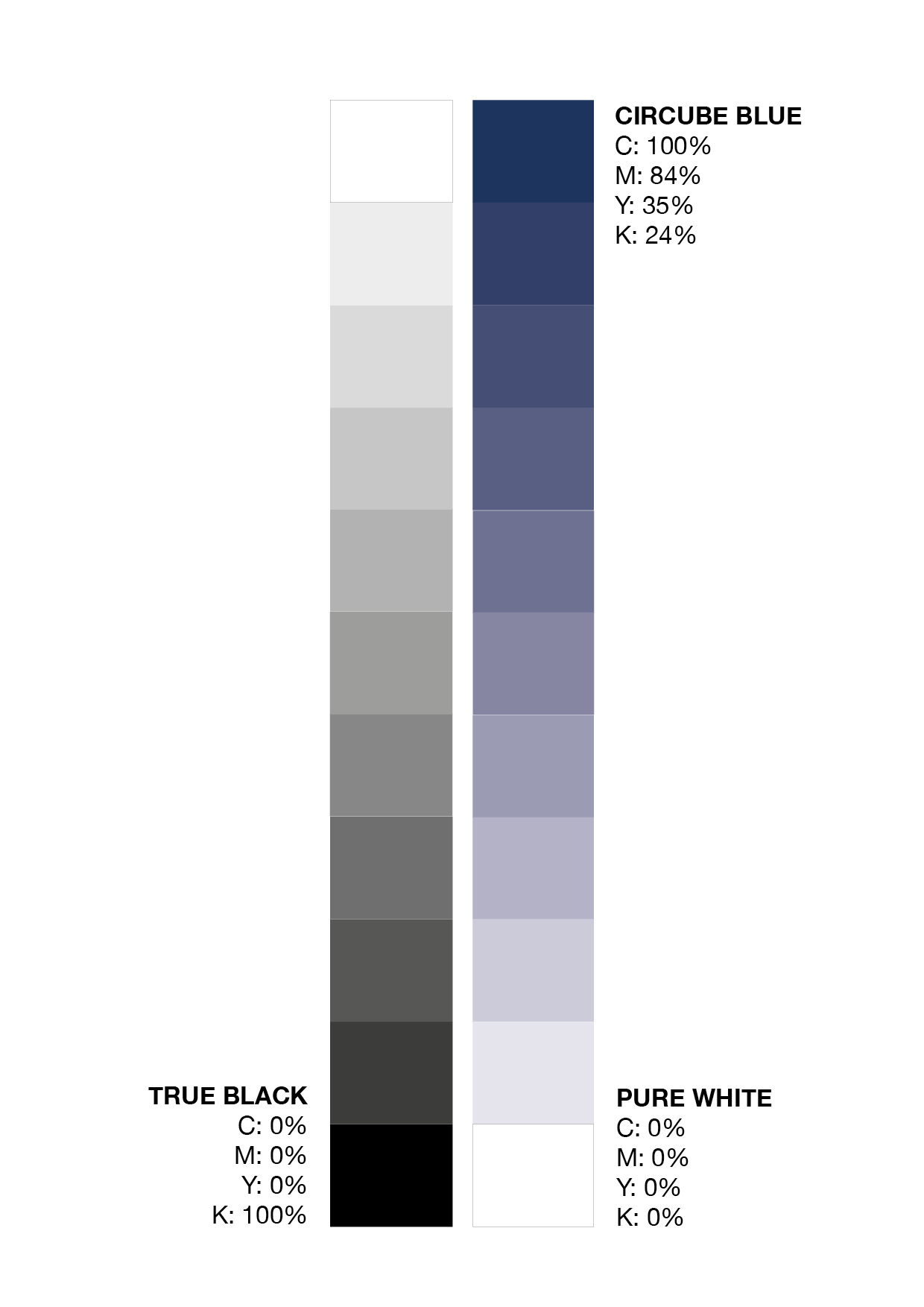
The color selection of black, white, and dark blue is minimal and modern. The black and white reflects the informative and transparent side of Circube. The blue has a hint of warmth and conveys trust to reflect the consumer experience. The blue is also a similar shade to denim, a highly utilized material in textlie recycling.
There are a few options for the ways in which the logo identity can be displayed. As a whole the identity creates a clear, bold, and accessible visual for the brand, which serves as the first and reoccuring touch point between our consumers and our brand.
The final version of the logo is a blend of the icon and typography design prototyped previously. These elements can be implemented separately or together depending on the context.
The icon is a combination of the three arrows in the recycling symbol and the outlines of a cube. Together they create a geometric circle shape with a 3D element. It also has visual references to a peace sign, which is in line with the principles of Circube. It has a heavy stroke, minimal lines, and is clear and concise. This makes it easy to understand and readable at any scale. The icon will be used to quickly spot our collection boxes, and create familiarity. It’s shape also serves as a point of reference for the typography design.
The Circube lettering uses the Moderna typeface, with an alteration of the letter U to form it into a squared shape. The majority of the letters in the word Circube are based on the circle shape, something very important to the branding and purpose of the company. The perfect geometry and balanced letterforms reference the icon and create harmony. The line break between “cir” and “cube” visualizes the story behind the brand name. Circube is a blend of the word circle and cube, the circle referring to circular business practices within fashion, and the cube referring to the Circube collection box. Both shapes are present throughout the identity design, especially within the typeface and icon.
The color selection of black, white, and dark blue is minimal and modern. The black and white reflects the informative and transparent side of Circube. The blue has a hint of warmth and conveys trust to reflect the consumer experience. The blue is also a similar shade to denim, a highly utilized material in textlie recycling.
There are a few options for the ways in which the logo identity can be displayed. As a whole the identity creates a clear, bold, and accessible visual for the brand, which serves as the first and reoccuring touch point between our consumers and our brand.
May 2023